Showing posts with label Hasselblad. Show all posts

Wednesday, April 06, 2022

King Kong Vs. Godzilla

Oh boy folks, this is a strange one, in which yer Sheephouse discovers his brain is wired in a very strange way.

I know what you're thinking (and probably have been thinking for a while). 
You're thinking:

"Ee's never content, not 'im. 
That geezer has more sense than money, or should that be the other way around. 
'Ee's a Nutter!"

And why would I be thinking that you're thinking that?
Well . . I've been spending again.

Y'see, during some mad, drunken, lockdown thinking, I thought I'd take up something I had always wanted to do (and was I the only one? Erm NO!)

The thinking was:

Why not learn to Play The Banjo?

Bonkers I know, blame it on Flatt & Scruggs And The Foggy Mountain Boys and The Beverley Hillbillies,  but once the seed was planted I could not get over it.

Anyway, I sourced one (a lovely Deering Picking Earl if you want to know) and a new case too (which, when it arrived slightly damaged [the case, not the banjo] I was told to "just throw away". I didn't - I repaired it and it was fine).

However, try as I might (and even though I got not bad at it) I just couldn't get used to the difference in size between a guitar neck and a banjo neck - my hand hurt all the time and something had to give. 
Seeing as I have played guitar since 1974, it had to be the banjo - which was a great shame really.
The story has a happy end though - it is in a new, happy home playing Grunge/Bluegrass, so all is right with the world. 

Anyway, the money that had been tied up in that chunk of wood, skin and weird resonaterey stuff, has now been sunk into lots more film; a B60 Polariser; an A16 back for the Hasselblad; AND on a whim, a prism finder for the 'Blad too.


© Phil Rogers
Kong Or Godzilla - You Decide


After some extensive reading on prisms (oh the sheer excitement!) it was either a NC2 or a PM. 
I watched and waited as usual, but nothing decent was around, until, one day, I discovered a PM45 - the final iteration of the Hasselblad unmetered prism (with those seemingly important these days [go figure] two blue stripes.) 
"Oooooh!" I thought, and it was within the budget, so I bought it.

Now if you Google these you'll see there are sellers wanting over £500 for one. 
This is utter madness
Mine was considerably less than that, and that is probably their worth. 
They're beautifully made, certainly, but £500????!!!! 
I dunno, the world has gone to pot - everyone is so greedy, and in the case of accessories, deranged.

Anyway, it arrived.
Perfect condition, great optics and, when properly focussed on an Acute Matte, a surprisingly bright and cohesive image. 
And the "Right" way around too.
The only problem was, 

NOTHING LOOKED RIGHT!

It is true. 
Not a sausage.

I think decades of viewing square bɘƨɿɘvɘɿ images (as has been the case with Rollie, Mamiya, Minolta, Hasselblad [and don't forget a long time immersed in the reversed, upside down oblong of 5x4]) has wired my brain to view the world in that orientation.
Obviously this is not the case with general living, only when using a camera. 
Crickey - I'd be up a creek if that were so. 


© Phil Rogers
The Gates Of Delerium


© Phil Rogers
Not What It Actually Looks Like
   Simply Because The Rubber Bit Got In The Way
This Is Heavily Cropped, But The Right Way Round
                                          

Thinking about it weirdly (as usual) it probably defines why I never felt quite at home with the Pentax 67 or the Koni-Omega (right way prism view and rangefinder respectively) and, if truth be told, I still find life hard using a 35mm camera.
The latter I find quite a strange thing to say too, because I cut my teeth on an Olympus OM10 and a Pentax K1000, before gearing up to the back-to-front big boys with the Mamiya C330F.

Obviously after all this time, my M2 and F's are second nature to use, but I have had a nagging thing at the back of my mind for a while, about giving up 35mm altogether and I am wondering whether the polarised viewpoint I have just encountered with the Hasselblad, has maybe been brewing for years. 

I don't actually know

All I do know is that it feels uncomfortable viewing the right-way-round world through the PM45 and yet switching back to the wrong-way-round WLF feels like putting on an old pair of house-trousers that I'll never throw out.


© Phil Rogers
Sanity Is Restored


It's a weird one isn't it. 
Maybe you feel the same way, maybe you don't.

It is probably just me
I think that being forced to view a reversed image makes one concentrate more on the image. If I remember rightly Ansel (or one of the Pantheon Of Analogue Gods) wrote something, somewhere, about the meditative effect of viewing a ground glass.
I think there is definitely something to it, and no matter what, me and those trousers have come a long way together.

Before re-reviewing this post I got the whole set-up out again and did more comparisons; things felt better this time, but not intuitive or comfortable, and I am also wondering whether the new sheer hulk of the 500C/M with the PM45 is contributing to my feelings. 
It has turned something already quite big, yet strangely svelte, into something more akin to a bucket of concrete.

This being said the view is impressively bright, and like old bud Bruce at the Online Darkroom has said (with regard to his Rollei SL66) a prism on a MF camera is probably something more suited to tripod handling. 
He's probably right.

I think I'll stick with the day-to-day, off-kilter world of composition with a reversed image, AND the lovely element of surprise when you view your newly developed negatives with what (to that point) had been in your mind's eye as totally reversed.

I need to do more work . . . or get out more.


© Phil Rogers
More Sanity Restored


© Toho Co., Ltd.
Personally I'd Go With Godzilla,
I Was Never A Kong Fan


And that as they say, is that.
A nice quick one today. 
No proper photographs posted because I haven't actually taken any since February - I dunno, I find it hard to justify 'self' time when I've got nearly 60 square metres of wall space to decorate, plus the woodwork. 
Madness.

Till next time, take care and watch out for The Atomic Breath.
H xxx


Sunday, August 22, 2021

The Perils Of Vanity

Morning folks - how are you all? It's been a while I know, but them's the uncertain times we live in!

Anyway, today's post is a salutary tale of a face-off between gut feelings and caution and a hang-it-all-why-not-throw-caution-to-the-wind attitude.
Oh yus, it doesn't get more intense than that. 

Like an episode of Looney Tunes with two angels, one on each shoulder, I battled with myself, until,  backed up by some goading and encouragement from friends and family, I capitulated.
It wasn't entirely unconsidered, but all the same, it was highly unusual for me.

And, as if I hadn't expected it, at its bitter end lay a bottom line that was a waste of the equivalent of roughly 5 rolls of FP4 money and a sour (entirely self-inflicted) taste, rather like eating a couple of bulbs of raw garlic and then going straight to bed.
What, you've never done that? Goodness me, what a sheltered life you have led!
 
On a positive note, it was also a welcome validation to myself that art (sic) can often be a largely pointless (but thoroughly enjoyable) exercise, and that I shouldn't expect any back-slapping or champagne corks from said engagement in it.

If you proceed further please bear in mind this blog is its own wee country and any views expressed within should be taken with a pinch of salt anyway.


So there I was, with an idea in my head and some really (so I thought . . really?) not bad photographs. They'd been gathered over a couple of years and after quite some time spent editing and thinning and reassessing and beard stroking and bum scratching and gallons of coffee, I got the herd down to seven images.

Why seven?

Ah well. It's that masked banditeer, that siren of dreams!

El Potty!

QUE?

Well Manuel, wait whilst I slap you around the back of the head and poke your eye with my thumb, El Potty, El Presidente, Channel 9!

Oh OK, when I go off onto one like this it is always (in my head) a mix of Dance Commander (by The Electric Six) and anything on Channel 9 courtesy of The Fast Show.

El Potty, is actually LPOTY, which, is actually an acronym of that fantasy land of fame: 

Landscape Photographer Of The Year.

So y'see,  the title of this blog is correct - The Perils Of Vanity.

I have to say kudos to the organisation - the whole process from cradle to grave is exceptionally smooth - it is easy to register, pay your money, upload your (albeit really small) thumbnail images, add the necessary attributes, write a bit about yourself, bask in the glow that you've actually done something and then sit back and await the Herald Angels with their trumpets, who are going to come down and hang about your house, drinking beer and smoking tabs, and then, when the message finally comes from the Gods of Landscape, they'll grab those horns and proclaim:

"Hark, all ye with eyes and ears, for they are here! 
Great Images, worthy only of The Second Coming Of St. Ansel await your attention. 
Come forth in great multitude and gaze in awe at their wonders!"

Or something like that, but the batards pissed off and hung about somewhere else . . .

Anyway, these are the really small thumbnails I submitted.

They were resized to about 1.5MB each - I do have massive scans of them too, but of course, being scans they're really not doing justice to the full-on print experience . . . but they're OK.


Hasselblad SWC/M, Phil Rogers, Dundee
Abandoned A-Frame


Hasselblad SWC/M, Phil Rogers, Dundee
Ancient Path


Hasselblad SWC/M, Phil Rogers, Dundee
Dawn Woods


Hasselblad 500 C/M, Phil Rogers, Dundee
Disused Railway Cutting


Hasselblad 500 C/M, Phil Rogers, Dundee
Flooded Path


Hasselblad SWC/M, Phil Rogers, Dundee
Pre-Christian Sacred Site


Hasselblad SWC/M, Phil Rogers, Dundee
Ritual Place


Hasselblad 500 C/M, Phil Rogers, Dundee
Rocks, Moss, Wood Sorrel

I entered them (funnily enough) in the Black and White Competition, which (from what I can see) largely seems to be slanted to that rather strange thing Digital B&W

I've often thought that was a peculiar one - you have a camera that can make a, what?, anywhere between 10 and 50+ megapixel image in colour and then you footer around and try to balance the software to make something that looks like it might have been made on film and printed in a darkroom on paper. 

It's about a thousand times easier to actually print an image the old way (as long as you do have access to a darkroom) and you know what, even bog standard, vin-ordinaire prints look pretty decent. 
When you get up into the heady realms of experienced printing then things become a tad more intensive, but they are still well within the bounds of being able to be done by ANYONE with a negative and some time on their hands
It's cheaper too (believe it or not) if you're going to be handling things, making prints and shoving your grubby thumbprints left, right and centre on an actual physical thing - if you don't believe me, go and have a look at the cost of 'professional' monochrome inks for inkjet printers - it is truly 100% shocking.

Anyway, I diverge. 
The 'we'll notify you' date passed and I was left with a sour taste in my mouth - worra BABY!
I suppose I should have known that competitions are vanity exercises anyway, but all the same, when you're beavering away at something like this and genuinely think you have a feel for Mother Nature, Atmosphere and Landscape In General, there's a bit of you that sort of hopes that after all these years  (a not inconsiderable 40) someone somewhere, might somehow quite like your stuff.
But it was not to be. 
I heard nothing, and threw my toys out of the pram, resulting in a solid 4 months of camera neglect. 

Really stupid dontcha think, but I guess in some vain way I was looking for validation of me and my snaps.

I am sure you'll be the same as me - you photograph because you enjoy it, but somewhere at the back of your most private thoughts there's a little bit of attention craving associated with our hobby. 
What if, someone, somewhere, went:

 I really like that

And sure, we'll get it from contemporaries and friends and in the case of this 'ere blog, you, my readers. I've always appreciated people's comments, but still some mad part of me craves more. 
Hence my folly in entering. 
And folly is the correct word. 

Why on earth should it matter to me (or indeed you) what people think? 

I've always been avowed that any artistic (sic) pursuit has to be about personal satisfaction first and then anything else (champagne, canapés, back-slapping, tipped nods) that follows is a bonus. 
But for some reason the dark cloud overtook me and there I was, £25 handed over to LPOTY and Associates and a sour taste in my mouth. 
Incidentally, my images were (on the site) in the range of entry numbers 36,000-ish. 
So that's 36,000 submissions from people all craving the same thing - obviously the actual number of entrants will be less as you're allowed a maximum number of images, however that is an awful lot of landscape wannabees.

 . . . Hmmmm, things that make you go hmmmm . . .

Anyway, enough of that - it sounds very sour on my behalf.
If I can say something positive about my rejection (sob, sob) it is that it has made me sit and think long and hard about this. 
And I have come to the conclusion, that I was right all along:

If I like it, that's fine and if anyone else does, well that's fine too, and if they don't well that's their choice - it's like water off a duck's back.

Why do I need validation from anyone, and especially from a bunch of 'experts' who mostly I have never heard of?
 
Madness indeed.

There is a coda to this, and I was going to include a nice little video of me setting fire to The Making Of Landscape Photographs. It's a decent book, but not my cup of tea as to what makes a good landscape photograph.
It was given to me by a compadre from Scottish Photographers as he no longer had any use for it - venting my ire seemed a good thing at the time (none of that bottling up of angst for me!) but down the line, I think its current state is more preferable - chewed by a really lovely dog called Bailey. 


The baby in me would say "Well done Bailey", however, to quote the old TV advert tagline for stout:

 "Like The Murphys, I'm Not Bitter".

I actually prefer Guiness these days so I am off to dip my Farley's Rusk into a nice cool pint of the Black Stuff.

TTFN - and remember, please keep taking photographs that please you and you alone.

Tuesday, March 16, 2021

Occam's Razor (ish)

Morning folks - well I got there eventually - sorry for any tardiness in publishing, but sometimes, well sometimes you're busy.
Anyway Spring is a Springin'!
Mornings are getting lighter and every photographer worth his salt should be getting out from under that thiosulphate-stained quilt and heading out with some fresh film and an attitude!

Attitude?

Oh yeah.

You've got to get moving!

Over the latter Winter months this year, I photographed seriously around (on average) three times a week. Now that's a lot for me, but it was good from the point of view that it helped sharpen my compositional viewpoint and instilled in me a realisation that I am really not getting any younger, and any day lost, is one less day of light.

Oh what a yawn dahling, what a lazy use of English.

It is true though, because it is the light that defines us.

It's easy for me to write that this morning, when the sun is up, but it is still brisk outside, but trust me, the light 'round these parts has run the gamut from utter pish through to heavenly. 
Overcast ghastliness and liquid silver; chucking rain; hard, low Winter sun; calf-length snow and bitter winds - I did them all.

It's been fun though; intensive and hard, and I discovered I rather like photographing buildings. 
I've done the found objects to death, so concrete stone, glass and steel it was. 
But rather than boringly detail each and every building I thought I'd get this melange of photos together and  show you what I did with relatively simple (albeit exquisite) equipment.


Oh, and why Occam's Razor? 

Well its underlying principle is that the simplest explanation is often the most correct. 
Not only that but I like the expression!

Photographically, I think there's way too much guff spoken about photography, both in the execution and also in the production of an end product. 
For instance, regular readers will know I have a total aversion to split-grade printing as I think it may possibly be useful, but on the whole feel it is far too footery for my ends. 
In the darkroom, and paraphrasing my old mentor Joseph McKenzie, simple is best.

I also re-read some of Fred Picker's Zone System Manual recently and oh boy, no disservice to Mr. Picker, but it really makes you want to put your lens cap on. 
Well it does me, even though there's plenty of useful stuff in there, the sheer complexity and footeriness really is enough to send one running.

So, simple is the by-word and without further ado, here's the pics!


Wall


Extreme dullness in the extreme, the above has something about it I like. I think it is the off-kilter banding from a mixture of pillar shadow and low sun.
This was made with a newly acquired, super-cheap 250mm CF Sonnar. It's got a couple of cosmetic issues but is a fine lens. As sharp wide open as it is stopped down, it has made me reconsider viewpoints. 
It was taken on HP5 rated at 200, processed in Pyrocat-HD and printed on Grade 3 Ilford MGRC.


1960's Concrete Brutalist


D'amore of a D'asame, as me old mate Sting used to say. 
Sonnar 250, HP5, Pyrocat and MGRC.
There's something gruesomely beautiful about the 'new' building at Duncan Of Jordanstone.
I think there's an air of Cold War stoicism about it.
Dundee has actually modelled for Russia in TV and film a few times - weird eh!


Progress


Back in the 60's the old Hawkhill was a mix of cottages, lanes, tenements and mills. It had character in spades and was torn down in the name of progress. 
When i arrived here, the last of the Hawkhill was condemned buildings, small shops hanging on by the skin of their teeth, and major works.
A great shame.
The modern thing in the background is part of the Life Science Centre and is a world leader in all things, er, life sciency.


Tree And Wall


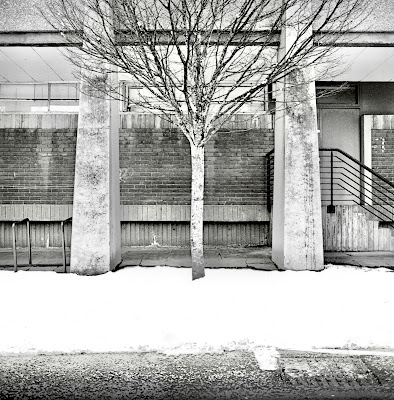
There's something about the juxtaposition of tree, shadow and wall that I really like.
The sun was low and hard and weirdly I was wielding Ilford's SFX with a deep red filter. EI was 6!
The lens was a CF 150mm Sonnar. Hasselblad's cheapest secondhand lens on average and a sterling performer at all apertures.
It was processed in Pyrocat and printed on Ilford MGRC again.
I use the RC to make work prints, which I'll turn into 'proper' prints on fibre paper when I get the time.
Making work prints this way on 5x7" paper is a quick and easy way of working that doesn't cost a fortune.
Again the old simple is best epithet applies.
Occam's Razor!


Winter


Yeah I know you Pickerites, there's no texture in the snow. 
Well actually you're wrong - there is, but this was just a quick print to assess things, so I shall burn the snow in slightly when I print it properly.
The snow is actually quite gungey and ugly from slush - maybe it's better pure white?
Film was HP5 in Pyrocat,  printed onto Grade 3 MGRC.
Lens was the 60mm Distagon - as fine a lens as anything you'll find. 
Zeiss recommended it for weddings, but I think it works brilliantly for landscape and 'tecture.


Future Dream


I haven't taken reflection photographs in a while, but I was so taken by this, that I had to take it. 
Sadly the double glazing has totally mucked up the quality of the reflection as it always does - bring back Victorian Plate Glass!
This was the 150mm Sonnar again and pretty much wide open.
Film is SFX and a deep red filter is in use.
Oh Yus . . .


The Hanged Man


Can you seen him? 
Me too, well I would wouldn't I because it was me. Not that I was hanging or anything . . .
This was taken about 2 weeks on from the last one - amazing the changes Winter will wrought. Snow was calf-deep in places, but I didn't let that stop me. 
The light is what I wanted to capture, but sadly it hasn't appeared here - maybe a better print would do it.
Lens was the 60mm Distagon.
It's a simple straight print on Grade 3 MGRC.


What If They Gave A Party And Nobody Came?


This was off the dreadfully under-developed roll of FP4. 
I now know my timings for next time so all is not lost and at least I hadn't walked 10 miles!
It's actually pretty underexposed too, but them's the breaks.
Camera was the SWC/M, and it was handheld at 1/15th at f8. 
It's very sharp.
The print was Grade 4 on MGRC - no need for split trousers or bleaching.


What The F?!


I really didn't realise I'd captured a Wild F, but I had. I just liked the shadows on the wall.
It was a tricky shot, me being on the ground and this being halfway up a fire escape.
I developed the film and lo and behold a Wild F!
Sadly the print is nothing like the contact print - could do better is what I'll say.
Lens was a Sonnar and Ilford SFX again.


Tunnel Of Weirdness


You know where dogs keep going back and peeing on the same wall?
Well . . . 
Though it doesn't look it, again this was the 150mm Sonnar with Ilford SFX.
I've tried to keep the composition as simple as possible, yet it's an enormously complex image.
Grade 3 print on MGRC.
Dead simple.


I.T.M.A.


Whilst technically not an architectural photo, I feel remiss for not including our old mate.
There's been many photographs of him since I discovered him, but this is one of my favourites, and I suppose that IS a building so I am excused a bit.
This was 1/15th at f8 with the 250mm Sonnar. 
I was a loooong way down the lane and it sort of shows what a long lens can do to space.
I actually like it very much.
Film was HP5 rated at EI 200 and developed in Pyrocat.
Print was a Grade 3 on MGRC just to snap things up a bit.
There was no wafting or wizard cloak involved in making the print: set grade, shove paper into easel, expose, develop. 
The whole thing was done in a few minutes.


Where Man Meets Nature


This isn't technically a 'simple' photograph as it is from the fogged and yucky roll of Bergger I detailed in the last FB, however it is a simple photograph.
Camera was the SWC/M, print was about Grade 5 on old Tetenal MGRC, which was already a very contrasty paper.
My nose was nearly touching that right hand wall!


Aliens At The V&A


The above is my absolute favourite. That marker post is so inutterably 'alien' that is sets the whole thing off.
It was taken on Ilford FP4 rated at EI 80 and developed in some really ancient HC110. 
Sadly the film is well under-developed simply because I couldn't get the right time. 
Times these days are all over the place - I think the assumption in all the literature out there is that you will be scanning the negative rather than actually projection printing them. 
Oh how the times (!) have changed.
I have to say, that I err on the side of Ralph Gibson and prefer a negative to be slightly on the cooked side - it gets you more meat and potatoes in a print. Not only that but a more developed negative is more easily correctable than an under-exposed or under-developed one. 

Oh and you might be wondering why I am talking like this - it's simply because I have nearly run out of Pyrocat, and am using anything and everything else I can find, and not only that, a change is as good as getting arrested.

Anyway, given the thinness of the above, I had to execute a swift side move. 
And what was that? 
Well, simple really, given the lack of snap in the negative I just printed it on Grade 4! 
It's a straight print apart from a wee bit of dodging to the out of focus beam at the top left.
That simple.

I really like the tonality.
It's weird really, FP4 is the most reasonable, consistent and reliable black and white film out there. I am stating that as a fact. Why waste your time testing films where the QC isn't a patch on the Mobberley Mob?
I am done with spending time composing, only to come back and develop something either flawed or inconsistent. I would use Kodak films too, because the quality control is impecable, but since they've decided to be so expensive, I'll no longer use them - shame.
Anyway, FP4 - its tonality can be wonderful. 
In my opinion, it is the pinnacle of monochrome tonality.

Photographically it couldn't have been simpler, albeit I was lucky with some really wonderful light and an eminently photogenic building.
The camera was my Hasselblad SWC/M and the photo was handheld, 1/15th of a second at f5.6.
As those bleedin' meercats used to say "Simples"!

And that's it really. 
Occam's Razor
Keep it simple.
I could probably have done the same with a Holga or the old Rollei T, or even the knackered Autocord . . . in fact that's a thought . . . . 
You really don't need bells and whistles to make images you are happy with.

There's an acronym: K.I.S.S.

Keep. It. Simple, Stupid.

I totally agree with that

Till next time, try it.
Unburden yourself from technicalities, sub-plots, menus, footeriness!
Go simple, and if you have a darkroom, get rid of all the stuff they tell you you have to have and have to use to get a result.
Use a single grade and your gut feelings about how the image should look, and have a go
You might well be surprised.

I guess what I am trying to say, is that at the end of the day, the final image is all that counts - if you can get there with the least possible number of complications, then that is all the better.
Why?
I don't really know actually, but probably backing it up is my old college conundrum whereby, given a problem to solve or a graphic to create, the more processes that went into the final thing, the more that thing was rendered null and void. 
Enthusiasm was sapped.
Energy drifted.
Creativity was stifled to the point of tedium, and at the end of the process, the initial thoughts and roughs seemed to be the ones that worked best.

Mies Van Der Rohe's epithet "Less Is More" rings true in so many situations, both literally and metaphorically.

Over and oot - beam me up Scotsman!


Friday, September 30, 2016

4K Burning Moggie

Morning folks . . well, in an unprecedented move here's another post . . .and in the words of a disgraced TV personality from the 1970's . . "whacka, whacka, whacka . . . . can you tell what it is yet?"

OK, so that's enough mystery for one day . . . the title of this blog is deliberately obscure just because. But anyway, the more Cryptic Clue-minded amongst you will have worked out, that seeing as this blog is mostly about photography,  and seeing as yer Sheephouse is mostly not quite all human, then the title "4K burning Moggie" can only relate to one thing . . oh yes . . PYROCAT-HD!

Pyro-wtf? Eh? Wot?

Yes, Pyrocat-HD, Sandy King's wonderful and really rather rooty tooty developer, that's what . . . so all I can say is fasten your safety belts, get your rubber trousers on (preferably before the safety belt) take a good swig of tea/coffee and prepare to be amazed!

Now the well-read amongst you will know that I have long extolled the virtues of Rodinal/R09 - I have loved this developer dearly for many years now and for sheer convenience and longevity, there's little can touch it . . but you know what it's like when you've broken your arm, and there's a wee crawly thing, crawling away under the cast and you're enraged and want to scratch it and you cant . . . well photography is like that. What if I had a better lens or better camera, or developer?
Well seeing as I've explored the former rather too thoroughly, I thought I would explore the latter. 

Over the years I've used, D76, ID11, Rodinal, Barry Thornton's 2-bath, HC110, Rodinal, R09, D23 and did I mention Rodinal? But I dunno, one day I woke up and thought, I must try that . . the that being Pyrocat. 
And then I started looking around and discovered that I could only buy industrial-sized quantities of Pyrocatechin from Silverprint and seeing as I was going to just be trying it, why did I have to spend around 50 squid on chemicals?
And I nearly gave up, but then a thought occurred to me and I did a wee bit of ebay searching and sure enough a kit came up - this link will take you to an ebay shop:


100% feedback helped me make my choice, so I ordered some - it was very reasonable (this was pre-Brexit, so it was really reasonable)! 
OK - chemicals off ebay . . hmm, yes, however, Vincenzo, the vendor, was incredibly helpful (and thus comes Sheephouse-recommended) with my requests about mixing instructions, and when his kit arrived, I was really surprised at how well put together it was
It looked like it was meant to be used professionally if you know what I mean; everything was pre-measured in sturdy plastic vials and the instructions were clear and concise . . . in other words, apart from the fact it wasn't in a box, it looked like something you could have bought from a 'proper' manufacturer. 
Seriously - I recommend having a go with his kits!
Allied to this, I also made the executive decision to mix Part A in Glycol, which apparently extends the life considerably. Now I could have ebay'd that too, however having bought some dodgy borax before, and given that Glycol is now used in production of e-cigarette vape, I took another executive decision and bought it and some distilled water from a place called Darrant Chemicals. They're a 'proper' chemical distributor to labs and schools and so on but don't mind dealing with normal bods too!

And so, it came to pass one Saturday morning I started mixing. 
The hardest thing about the whole process was getting the Glycol hot enough to dissolve the chemicals in. I had to use a double boiler (in my case a jug in a pan of boiling water) which resulted in me over-heating it! My thermometer was reading a constant temp and then all of a sudden it jumped sharply - so if you are doing this, take care, CONSTANTLY MONITOR YOUR TEMPERATURE and try not to rush (which is what I was doing).
Rushing this is definitely not recommended, just because it'll take you a while to do it properly, and if you rush and don't concentrate enough you run the risk of spoiling all those lovely chemicals.
The second hardest thing was mixing the Potassium Carbonate in. It took a lot of stirring. But don't let me put you off - it is an adventure. And a worthy one!
When it was mixed, I think my overheating of the Glycol and the mixing in of the chemicals for Part A had partially oxidised the solution it had the faintest pinky/purple hue to it, but I had made it, and I was determined to use it, so ahead I went.

The first films (expired sheets of 5x4) I developed in it seemed awfully under-developed (based upon times found on the net) and the usual dilution of 1+1+100, so I moved to 2+2+100 which was good but very very contrasty. 
This set me back a bit, but after some convos with Ian (lostlabours on FADU) we concluded I must have oxidised Bath 1 . . . I still didn't want to give up, so I thought about it and came to the conclusion (based on his times) that I needed a new approach.
A quick word here - most times you find on the net these days are for scanned negatives - they can afford to be thinner. We are printing . . we need meat and potatoes, so if you are getting a time off the net, make sure someone has actually printed some negatives from it and not just developed and scanned..

Anyway, my first move was to cut box speed to half, and the next was to extend the development time massively (I figured if it was hard to blow highlights with it, then the only thing I was going to do was lift the shadows . . . same with the new film speed). 
Anyway, what this meant is that my new times for Delta 400 (which I have been using recently) are EI 200 and with PHD at 1+1+100 and 20 C, I develop for 19 minutes. This consists of continuous gentle agitation for 30 seconds then 3 gentle inversions every minute up to 17 minutes, then let it stand to 19 or even 20 minutes. 
This is longer than the old days of dilute Perceptol!!!!

So where does all this tomfoolery get us? 
In a new space where film development takes a lot longer, but where you'll struggle to burn-out any over-exposed highlights and where, with a modicum of technique tickling you can produce negatives that are just about damn near perfect. 
 Now you read about the perfect negative a lot - certainly the Reverend Sir Barry Of Thornton did his best to produce such things and I know he did, but some of them proved that you needed to be a little pernickity with your technique. As good as BT 2-bath is, I found that for all it's ability to even out exposure times into one homogenous whole, it somehow lacked contrast, whereas I can honestly say with Pyrocat, you'll regain that contrast, but also you'll gain balance.
Yes care is still needed - it's like giving birth (not that I ever have to a human, but there's things men give birth to that put women to shame . . .  anyway . . . hope you've still got some savour left for that croissant.
And how have I come to this conclusion about PHD? 
Well, go on, have a gander at this.


This is a straight print. 
No dodging or burning, just a print made direct from the negative in a glass carrier printed onto some ancient Adox Vario Classic (now long gone) paper - I filtered to a Grade 3 because of its age. 
Chemicals were bog standard: Fotospeed developer, Kodak Stop and Ilford Fix, a very light toning for archival purposes in Kodak Selenium and that was that.
Admittedly I am using one of the finest MF lenses ever made - the 60mm Zeiss Distagon*** which can do pretty much anything required of it, from pin-sharp detail, to easy to use hyper-focal measuring (very handy in the semi-twilight of an abandoned building) to wonderful, creamy out of focus stuff, to micro-contrast, to gorgeous greys and a massive tendency to flare, but all the same . . . .

If you look closely at the print, the lens (and developer) have managed to do a sterling job of capturing a really hard lighting situation: the wall at the right was in bright light, the wall to the left was in shadow and overshadowed by dense vegetation, and the bit at the end of that wall was in a half-light. 
It would have proved soot and whitewash with many setups, but this is balanced
Not only that but the Zeiss has somehow managed to capture pin-sharp detail and contrast and blended it with some of the nicest out of focus stuff I have seen, but that has been captured with less contrast and somehow lends an overall 'older' feel to the image whilst still retaining the sharpness and contrast of a modern lens. 
When I saw this as a negative I was bowled over - it looked gorgeous, and the same happened with the print too. 
CHUFFED is not the word . . add a FECKING to the start . .
 
This was taken whilst on holiday in June and is a looong story that involved me walking countless miles to try and reach an old Norman Motte and being defeated every time, by fences and walls, bulls, rain, crops, more walls and some of the tallest, wettest bracken you have ever seen, so I gave up. And then before you could say bunga-ahomogenius-tomato I came across a sad (yet wonderful) semi-derelict cottage. 
At least, it could be even more beautiful were it not hard up against a road and if someone had taken it in hand a couple of decades back rather than let it slide into disrepair.

Here's some more pictures.


These exposures ran the gamut from 1/15th at f5.6 (the first print) to 145 seconds at f11 (the third, interior shot) . . BUT they're all on the same film. Now do you see what I mean about a near perfect developer.

Yes I know, they're hairy scans and there's a few rebate mistakes, but on the whole what do you think? 
They were easy as anything to print. No messing. No SP**-GR***. Nothing like that.

A Little Sheephousian Aside:
You know, I read some of my printing books and look at split-grade this and split-grade that and think, you know what? in 3 decades of printing (pretty much, minus the 15 year gap, but it does sound better than in a decade and a half's printing . . ) I've never seen any point in split-grade - it just seems like so much faff to achieve a print that really, could be done with a lot more basic techniques. yeah dodge and burn, selective bleaching and selenium or any toner you fancy. 
Seriously, printing is a craft skill that can be achieved by anyone with an eye for tone and quality.
The caveats I would add to this are try and make it fibre paper if you can, though to be fair the RC papers that are left are pretty decent, but there's something about a fibre print. Also, dare I say it, try and find graded paper - that narrows your options down massively, but if you don't feel confident, go MG paper. 
To be honest I have never used Ilford's ubiquitous MG in fibre. I used to use it a fair bit in RC and never really got on with it - maybe I am missing something. 
Ilford's Galerie on the other hand is probably top of the heap for paper quality these days - yes you have to re-mortgage to buy it, but honest, there's nothing like it anymore. 
At the end of the day I believe the cost to be worth it.
Another paper I do really like is Adox's take on Agfa MCC - it is pretty close, though not quite. The original Agfa papers were outstandingly beautiful AND kind to the printer, seemingly producing decent prints from even the most cack-handed of efforts.
How long have we got left as printers and printmakers? I really don't know. It all depends on the young and whether they feel they can justify spending nearly £90 on a box of 100 sheets of 8x10"!
How sad it has come down to this - in a world awash with imagery, does anyone care anymore about handling a physical print? Or are we at the narrow part of the pass - the vintage prints will carry on and be lauded, the work of the concerned and talented amateur, and I am talking to any of you out there who have cared enough about printing to actually make your own are destined for the skip of eternity. You know what it is like:
"I see your Uncle Ernie died . . I was sorry to hear that"
"Yeah, thanks. He was a funny old fucker really. Had all this old school photographic stuff and boxes and I mean boxes and boxes of pictures, big ones of all sorts of shit - trees and signs and strange things - it was so much to look through. In the end we didn't have the time 'cause we had to clean his house out and get it on the market before Winter. We chucked the whole lot in the skip. All that work of his. The only thing I saved was this picture he made - it's about 6x6" square and it's of a dog in a hat and the dog is looking right at the camera and I dunno . . it just makes me laugh. Ernie liked that sort of thing."

Back To The Point:

Anyway, where were we . . . ah yes Pyrocat-HD. 
Bloody marvellous stuff.
They say a picture is worth a thousand words . . so I'll stop now.
If anyone wants to know more, please leave a message at the bottom, or do some trawling - there's a lot of stuff written about it.
Suffice to say, I can see myself using this for a good while yet . . and next time I might even mix it with more care!

TTFN, and remember, around the ragged rock, the ragged rascal ran, until his trousers fell down

*** Why do I say this? Well, renowned Rollei fan, Helmut Newton. Now I like his photographs so I was rather surprised when I visited his museum, in Berlin that in a case with his other cameras, was a Hasselblad with a 60mm Distagon . . . food for thought!