Morning folks - well I got there eventually - sorry for any tardiness in publishing, but sometimes, well sometimes you're busy.
Anyway Spring is a Springin'!
Mornings are getting lighter and every photographer worth his salt should be getting out from under that thiosulphate-stained quilt and heading out with some fresh film and an attitude!
Attitude?
Oh yeah.
You've got to get moving!
Over the latter Winter months this year, I photographed seriously around (on average) three times a week. Now that's a lot for me, but it was good from the point of view that it helped sharpen my compositional viewpoint and instilled in me a realisation that I am really not getting any younger, and any day lost, is one less day of light.
Oh what a yawn dahling, what a lazy use of English.
It is true though, because it is the light that defines us.
It's easy for me to write that this morning, when the sun is up, but it is still brisk outside, but trust me, the light 'round these parts has run the gamut from utter pish through to heavenly.
Overcast ghastliness and liquid silver; chucking rain; hard, low Winter sun; calf-length snow and bitter winds - I did them all.
It's been fun though; intensive and hard, and I discovered I rather like photographing buildings.
I've done the found objects to death, so concrete stone, glass and steel it was.
But rather than boringly detail each and every building I thought I'd get this melange of photos together and show you what I did with relatively simple (albeit exquisite) equipment.
Oh, and why Occam's Razor?
Well its underlying principle is that the simplest explanation is often the most correct.
Not only that but I like the expression!
Photographically, I think there's way too much guff spoken about photography, both in the execution and also in the production of an end product.
For instance, regular readers will know I have a total aversion to split-grade printing as I think it may possibly be useful, but on the whole feel it is far too footery for my ends.
In the darkroom, and paraphrasing my old mentor Joseph McKenzie, simple is best.
I also re-read some of Fred Picker's Zone System Manual recently and oh boy, no disservice to Mr. Picker, but it really makes you want to put your lens cap on.
Well it does me, even though there's plenty of useful stuff in there, the sheer complexity and footeriness really is enough to send one running.
So, simple is the by-word and without further ado, here's the pics!
 |
| Wall |
Extreme dullness in the extreme, the above has something about it I like. I think it is the off-kilter banding from a mixture of pillar shadow and low sun.
This was made with a newly acquired, super-cheap 250mm CF Sonnar. It's got a couple of cosmetic issues but is a fine lens. As sharp wide open as it is stopped down, it has made me reconsider viewpoints.
It was taken on HP5 rated at 200, processed in Pyrocat-HD and printed on Grade 3 Ilford MGRC.
 |
| 1960's Concrete Brutalist |
D'amore of a D'asame, as me old mate Sting used to say.
Sonnar 250, HP5, Pyrocat and MGRC.
There's something gruesomely beautiful about the 'new' building at Duncan Of Jordanstone.
I think there's an air of Cold War stoicism about it.
Dundee has actually modelled for Russia in TV and film a few times - weird eh!
 |
| Progress |
Back in the 60's the old Hawkhill was a mix of cottages, lanes, tenements and mills. It had character in spades and was torn down in the name of progress.
When i arrived here, the last of the Hawkhill was condemned buildings, small shops hanging on by the skin of their teeth, and major works.
A great shame.
The modern thing in the background is part of the Life Science Centre and is a world leader in all things, er, life sciency.
 |
| Tree And Wall |
There's something about the juxtaposition of tree, shadow and wall that I really like.
The sun was low and hard and weirdly I was wielding Ilford's SFX with a deep red filter. EI was 6!
The lens was a CF 150mm Sonnar. Hasselblad's cheapest secondhand lens on average and a sterling performer at all apertures.
It was processed in Pyrocat and printed on Ilford MGRC again.
I use the RC to make work prints, which I'll turn into 'proper' prints on fibre paper when I get the time.
Making work prints this way on 5x7" paper is a quick and easy way of working that doesn't cost a fortune.
Again the old simple is best epithet applies.
Occam's Razor!
 |
| Winter |
Yeah I know you Pickerites, there's no texture in the snow.
Well actually you're wrong - there is, but this was just a quick print to assess things, so I shall burn the snow in slightly when I print it properly.
The snow is actually quite gungey and ugly from slush - maybe it's better pure white?
Film was HP5 in Pyrocat, printed onto Grade 3 MGRC.
Lens was the 60mm Distagon - as fine a lens as anything you'll find.
Zeiss recommended it for weddings, but I think it works brilliantly for landscape and 'tecture.
 |
| Future Dream |
I haven't taken reflection photographs in a while, but I was so taken by this, that I had to take it.
Sadly the double glazing has totally mucked up the quality of the reflection as it always does - bring back Victorian Plate Glass!
This was the 150mm Sonnar again and pretty much wide open.
Film is SFX and a deep red filter is in use.
Oh Yus . . .
 |
| The Hanged Man |
Can you seen him?
Me too, well I would wouldn't I because it was me. Not that I was hanging or anything . . .
This was taken about 2 weeks on from the last one - amazing the changes Winter will wrought. Snow was calf-deep in places, but I didn't let that stop me.
The light is what I wanted to capture, but sadly it hasn't appeared here - maybe a better print would do it.
Lens was the 60mm Distagon.
It's a simple straight print on Grade 3 MGRC.
 |
| What If They Gave A Party And Nobody Came? |
This was off the dreadfully under-developed roll of FP4.
I now know my timings for next time so all is not lost and at least I hadn't walked 10 miles!
It's actually pretty underexposed too, but them's the breaks.
Camera was the SWC/M, and it was handheld at 1/15th at f8.
It's very sharp.
The print was Grade 4 on MGRC - no need for split trousers or bleaching.
 |
| What The F?! |
I really didn't realise I'd captured a Wild F, but I had. I just liked the shadows on the wall.
It was a tricky shot, me being on the ground and this being halfway up a fire escape.
I developed the film and lo and behold a Wild F!
Sadly the print is nothing like the contact print - could do better is what I'll say.
Lens was a Sonnar and Ilford SFX again.
 |
| Tunnel Of Weirdness |
You know where dogs keep going back and peeing on the same wall?
Well . . .
Though it doesn't look it, again this was the 150mm Sonnar with Ilford SFX.
I've tried to keep the composition as simple as possible, yet it's an enormously complex image.
Grade 3 print on MGRC.
Dead simple.
 |
| I.T.M.A. |
Whilst technically not an architectural photo, I feel remiss for not including our old mate.
There's been many photographs of him since I discovered him, but this is one of my favourites, and I suppose that IS a building so I am excused a bit.
This was 1/15th at f8 with the 250mm Sonnar.
I was a loooong way down the lane and it sort of shows what a long lens can do to space.
I actually like it very much.
Film was HP5 rated at EI 200 and developed in Pyrocat.
Print was a Grade 3 on MGRC just to snap things up a bit.
There was no wafting or wizard cloak involved in making the print: set grade, shove paper into easel, expose, develop.
The whole thing was done in a few minutes.
 |
| Where Man Meets Nature |
This isn't technically a 'simple' photograph as it is from the fogged and yucky roll of Bergger I detailed in the last FB, however it is a simple photograph.
Camera was the SWC/M, print was about Grade 5 on old Tetenal MGRC, which was already a very contrasty paper.
My nose was nearly touching that right hand wall!
 |
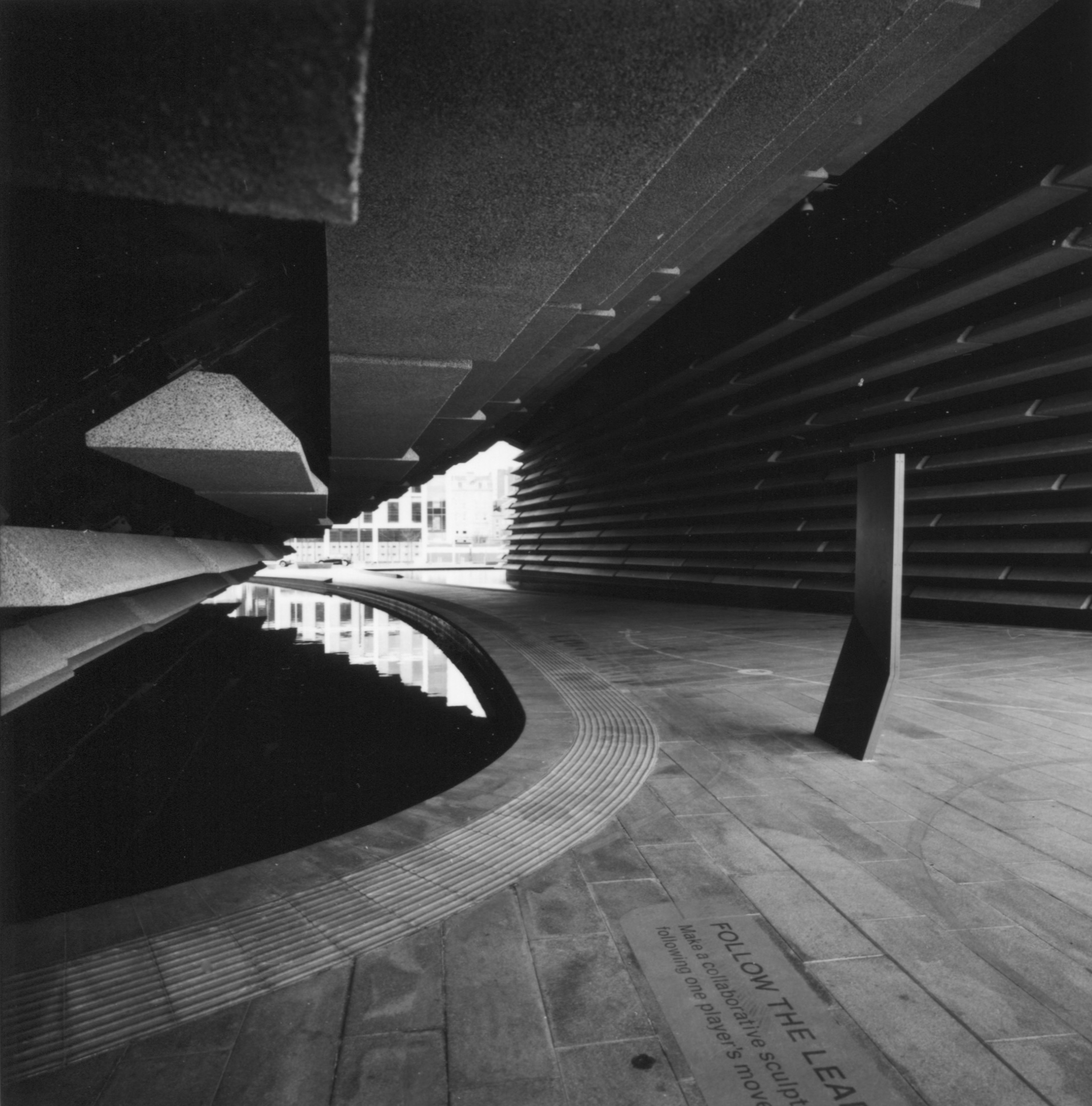
| Aliens At The V&A |
The above is my absolute favourite. That marker post is so inutterably 'alien' that is sets the whole thing off.
It was taken on Ilford FP4 rated at EI 80 and developed in some really ancient HC110.
Sadly the film is well under-developed simply because I couldn't get the right time.
Times these days are all over the place - I think the assumption in all the literature out there is that you will be scanning the negative rather than actually projection printing them.
Oh how the times (!) have changed.
I have to say, that I err on the side of Ralph Gibson and prefer a negative to be slightly on the cooked side - it gets you more meat and potatoes in a print. Not only that but a more developed negative is more easily correctable than an under-exposed or under-developed one.
Oh and you might be wondering why I am talking like this - it's simply because I have nearly run out of Pyrocat, and am using anything and everything else I can find, and not only that, a change is as good as getting arrested.
Anyway, given the thinness of the above, I had to execute a swift side move.
And what was that?
Well, simple really, given the lack of snap in the negative I just printed it on Grade 4!
It's a straight print apart from a wee bit of dodging to the out of focus beam at the top left.
That simple.
I really like the tonality.
It's weird really, FP4 is the most reasonable, consistent and reliable black and white film out there. I am stating that as a fact. Why waste your time testing films where the QC isn't a patch on the Mobberley Mob?
I am done with spending time composing, only to come back and develop something either flawed or inconsistent. I would use Kodak films too, because the quality control is impecable, but since they've decided to be so expensive, I'll no longer use them - shame.
Anyway, FP4 - its tonality can be wonderful.
In my opinion, it is the pinnacle of monochrome tonality.
Photographically it couldn't have been simpler, albeit I was lucky with some really wonderful light and an eminently photogenic building.
The camera was my Hasselblad SWC/M and the photo was handheld, 1/15th of a second at f5.6.
As those bleedin' meercats used to say "Simples"!
Occam's Razor.
Keep it simple.
I could probably have done the same with a Holga or the old Rollei T, or even the knackered Autocord . . . in fact that's a thought . . . .
You really don't need bells and whistles to make images you are happy with.
There's an acronym: K.I.S.S.
Keep. It. Simple, Stupid.
I totally agree with that
Till next time, try it.
Unburden yourself from technicalities, sub-plots, menus, footeriness!
Go simple, and if you have a darkroom, get rid of all the stuff they tell you you have to have and have to use to get a result.
Use a single grade and your gut feelings about how the image should look, and have a go.
You might well be surprised.
I guess what I am trying to say, is that at the end of the day, the final image is all that counts - if you can get there with the least possible number of complications, then that is all the better.
Why?
I don't really know actually, but probably backing it up is my old college conundrum whereby, given a problem to solve or a graphic to create, the more processes that went into the final thing, the more that thing was rendered null and void.
Enthusiasm was sapped.
Energy drifted.
Creativity was stifled to the point of tedium, and at the end of the process, the initial thoughts and roughs seemed to be the ones that worked best.
Mies Van Der Rohe's epithet "Less Is More" rings true in so many situations, both literally and metaphorically.
Over and oot - beam me up Scotsman!