Morning folks - I hope you are well.
It is an interesting title isn't it, and you're probably wondering:
"Oh JEEEEZ, what is the olde fart on about now."
I will say, you might well be raging by the end, but don't let that stop you either way; be warned, it's quite long; a tad opinionated and as such a thing is as valid as any other argument . . .
So put your feet up, get someone to loosen the straightjacket and let's begin.
 |
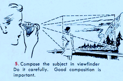
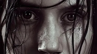
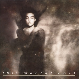
Top Photo - Modern 'Photography'
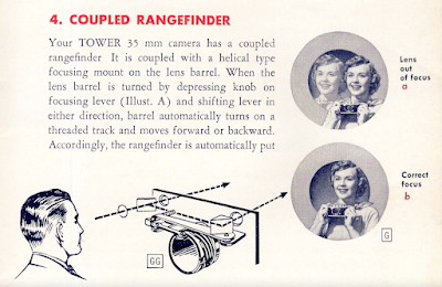
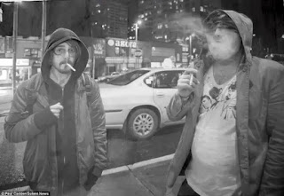
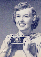
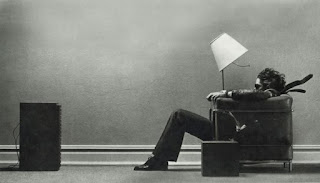
Bottom Photo - Photography As I Knew It |
Firstly, let me explain myself.
I photograph.
I love photographing and I love printing.
I love the smell of fixer and stopbath.
I love my darkroom.
And I love the sheer difficulty/easiness of being able to punt out into the world an image that is not only of some worth to myself, but also (possibly) has some longevity by nature of its actual PHYSICAL PRESENCE.
That being, a bog standard negative and a darkroom print.
I regard them as little boats of time being shoved upstream into an unknown future . . quite often made with a mechanical marvel constructed when I was much younger or, in some cases, not even a glint in my father's eye.
In other words, you've got it, I love photography.
It holds gravitas for me.
It is an important and often surprising part of my life.
But here's the rub. I increasingly find myself looking around at a lot of the stuff currently classed as 'photography' and then reaching into a cupboard for my ruffled shirt, slightly baggy-at-the-knees boating pants, white socks, a very cool pair of aviators and just possibly (if I am wearing one) I might even roll up the sleeves on my jacket.
Then I'll drag out the ghettoblaster and stick on a cassette with fab hits from A Flock Of Seagulls, OMD, Human League and many other forward thinking 'futuristic' pop combos; heck I might even have a boogie to 'Magic Fly' by Space.
Then I say to myself:
'Great, let's do it!'
 |
| Isn't that just the best photographic advice you've ever had? |
You see, is it just me, or has the 'photographic' community been transported back a few decades to the era of shoulder pads and big money?
Stick with me on that, all will be explained.
I was brought up short recently by a link to an esteemed Photographic Societies competition winners website (try saying that sentence when you are drunk).
A lot of what I saw, NOW IN 2023, reminded me a hell of a lot of what I had seen in the 1980's.
It shocked me enough to write this post.
To illustrate the point, if you've got it, a worthy tome from 1981 - Michael Langford's superb "Darkroom Handbook" - page 292.
Got it? - Bob Carlos Clarke's montage of the man with dry earth for his mouth and some sort of electrody brain machine on his head.
Colourise it, and then stick it in as an entrant
here
Och, stuff it, here y'go!
How about page 250 - some 'Advanced Posterization' . . yep - same too.
Or page 229 - 'Multiple Printing':
Or Bob C-C again in 'Montage':
You've got to remember the age of these, yet they'd all work in an exhibition 42 years too late.
Failing that, pick up pretty much any photographic book published on the 80's and 90's where the photographer is having a go at something 'arty' . . . is it just me, or does it all look 'current'.
Back to THE NOW - you have to believe me when I say I am not having a go at any of the competing 'photographers' (everyone can do a Fleetwood Mac; one person's 'art' is another person's dirty bed etc etc) because in said competition there are some pictures which you would obviously call photographs.
But the composites?
The obvious set-ups and chewed over stuff?
Well . . .
To be honest I never thought that much of that sort of stuff was relevant back in the 1980's (though, I know manipulation has been going on since the dawn of photography, but that's not the point.)
Back then they always seemed like exercises that served as a 'see what I can do' amusement, rather than carrying any real photographic gravitas.
And I know you'll think I am walking on thin ice with that statement, but like I say, it is just my opinion.
I also know you'll say:
"Surely that's what you do in a darkroom - you manipulate a negative"
Yep, spot on, but again, not my point.
With the montaging, multiple printing, colourising etc back then, sure some people made a good living from it. Some people were even brilliant at it.
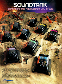
I can draw your eyes to say any number of (as an example, say) musical instrument adverts from the 1980's; they all looked so modern with the delay units (sic) floating through space like cast-off Star Wars models; or a battle plain on a distant world, lined with pedals all ready to to fight the good fight for RAWK . . .
But it was just advertising.
It might well have been made using traditional photographic techniques and great darkroom skills, but it wasn't what I would call photography - it was image making and there is a distinct difference.
It used 'photography' to illustrate the product; to pursuade you (yes you, potential RAWK GOD) that if you would only purchase said product, you too could be creating futuristic music on a distant planet.
 |
| OK - I know this was from 1992, but you get the idea. |
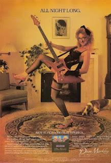
In fact, I am not going to spare you the pain . . . get a load of this:
 |
| UGH! |
Image making has always been a distinctive aside (in my opinion - I always thought it went hand-in-hand with graphic design) and certainly there has been a lot of great image making that could also also be classed as great photography; but the bounds are very fluid.
To give some background, I come at image making, graphic design and illustration from an era when everything was done manually.
As an example, we used to have to trace text from Letraset catalogues (the actual product was far too expensive for an impoverished student) on a large DeVere copy camera. This tracing was the actual typography you wanted to use - your slogan, if you like. When you'd got it all laid out, you'd reverse the tracing paper, overlay 2B pencil on the back, take it to your illustration board, carefully tape it down, then trace over your original Letraset lettering thus transferring it to the board and then, you'd go over the lettering on the board with a rapidograph.
Does it sound complex and time consuming?
Damn right it was!
Nowadays though, rather than days and weeks spent trying to get something like that out, it is now available at a simple command.
Jeez, it was even easy with all sorts of Adobe stuff, but now, I can just describe it and accomplish something remarkably 'real'.
Be warned - everyone that can string two words together has the ability to produce something as just as cheesey as the above adverts!
Be warned - everyone that can string two words together now has the ability to produce a 'photograph'.
And that's not even my point - technology changes, you either run with it and try to catch up all the time, or you entrench yourself - rather in the way I have.
How many of the competition winners are text-based? No idea.
But it isn't even the execution - shit happens, times change, people move onto 'better' things..
No, it is the CONTENT.
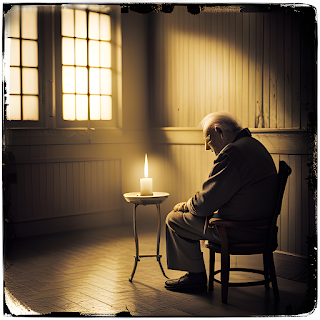
Here's something I knocked up from Freepik.com.
My Words: "An old man in a room with a candle" - Style: Vintage (cos I am)
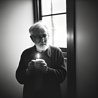 |
| "An old man in a room with a candle" |
Sure it is overly contrasty and looks a bit computer generated, but on the whole, if you'd told me that was taken on a digital camera, I wouldn't question it.
If however you said it was taken on a Jupiter lens with Rollei Retro I would disagree, initially, because the look is very similar.
Unlike the latter though, it does not exist in anything I would call useful to me - it is just a low-res png.
Here's another - same description:
 |
| "An old man in a room with a candle" |
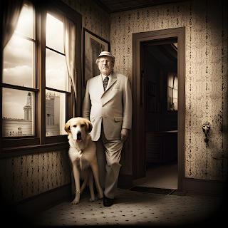
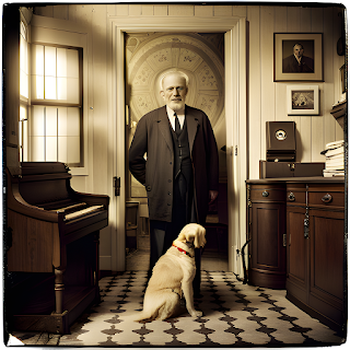
And another - my description a bit more detailed: "a man in a room with a large dog and christian imagery on the walls"
 |
| "A man in a room with a large dog and christian imagery on the walls" |
And again:
 |
| "A man in a room with a large dog and christian imagery on the walls" |
If I were to tell you I had set both of them up and used a Hasselblad with a 60mm Distagon, you might well be convinced.
But I didn't!
OK - they're not perfect, but sign up and pay your money for a high resolution download, open your Lightroom and get tweaking . . SEE WHAT I MEAN?
I didn't even put any thought or effort into those save the typing.
Anyway, back to our competition:
An Orangutan with a fecking dandelion seed head? 🙄
A Bison that looks like it has half of a Hollywood lighting team off to the right?
The person with the brainy-thing and the bird?
The people with the brollies that look like a Jack Vettriano painting?
The bloke with the big dog that looks like an exercise in painting a dog?
Every single colour portrait that looks like a hypereal illustration?
Landscapes that look like no landscape has ever looked in the entire lifetime of this planet?
They could all have been generated by Freepik (sic)
What we are seeing folks, is The Dissolve.
Photography as we know it (well, as I knew it) doesn't really exist anymore, except in niches that are as anachronistic as shoving children up chimneys to sweep them.
Sure, a lot of the competition's entries will have been 'captured' (God I hate that word) on things resembling cameras/might well be called cameras. but a lot of the assembled images have more in common with Father Ted's car, than they do with photography.
You've never seen Father Ted's car?
Well, you can find the clip
here.
Do you see what I mean?
Everything has been so worked and reworked and perfected and tweaked and reworked again and added to and subtracted from, that the end result looks nothing like a photograph.
Folks, we have entered the world of illustration.
And photographers, don't think you're an illustrator, because you're not.
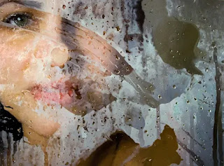
These are illustrators operating in 'Hyperealism':
 |
| © Alyssa Monks |
 |
| © Dirk Dzimirsky |
 |
| © Luiz Escañuela |
 |
| © Paul Cadden |
Yep, they're NOT photographs.
They're all achieved with oil, pencil, pen, acrylic, gouache, and skill.
One does wonder what the point is though!
So the question I am going to throw out there is:
Which do you prefer:
The photographs trying to look like illustrations?
OR
The illustrations trying to look like photographs?
Again, I am knocking no one - the skill levels involved in the latter are extraordinary - I think I come down on the illustrator's side.
Oh, it's time for a nice cup of Mrs Doyle's tea.
 |
Aaaah!
That's better!! |
You've made it so far, hang on in there old bud, there's more to come . . .
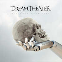
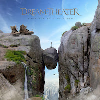
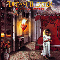
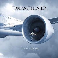
As a weird aside, the popular prog-metal band Dream Theater have a long history of illustratively photographic (is that a thing?) album covers going back to the late 1980's.
As they were/are a 'thinking man's' band, why not have some 'thinking man' style covers?
There's been a slew of illustrations from this train of album cover thought - you might even own some.
 |
| © Dream Theater |
 |
| © Dream Theater |
 |
| © Dream Theater |
 |
| © Dream Theater |
Initially, they were done 'photographically' and illustratively; then Photoshop and mixed media took a hand, and I've no doubt they'll soon be (maybe even are) Ai.
One can link that lineage back to Hugh Syme and his conceptathons, and even further back to Roger Dean, Jim Fitzpatrick, Bob Haberfield, Patrick Woodroofe (and all the great conceptual illustrators of book jackets over the years, but especially the 1960's and 70's).
Also, I would be completely remiss if I never mentioned Hipgnosis with Aubrey Powell, Storm Thorgerson and George Hardie (great little article here.)
Probably more than any other, they're at the root of what is happening today.
As an aside, I loved Hipgnosis.
Still do.
But it was album cover design.
It was part of a concept.
It fulfilled the brief to bring an artist's music to an adoring public in a complete package that made you think.
There were many companies operating in that field, producing sleeves that were every bit a work of art as anything hanging in a gallery.
I can point a finger at 4AD, with Grierson and Oliver producing a distinctive mesh of graphics and photography which would define the look of the label (as well as being superlative pieces of Graphic Design).
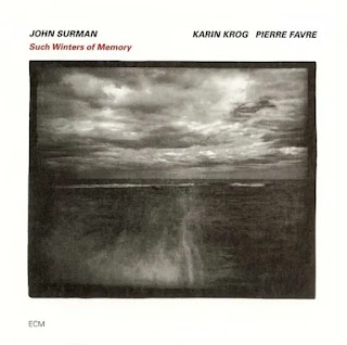
Or ECM where Manfred Eicher's vision for the label incorporated tremendous photography, which stood as just as an important part of the album's presence as what was held within their gorgeous heavyweight sleeves.
 |
| Hipgnosis |
 |
| ECM |
 |
| 4AD |
Influential wouldn't you say?
And when you start swimming the dark seas of album covers you uncover much more of what today is award winning 'photography'.
In other words, there's a lot of it out there; it has been done better already and more importantly:
IT HAD PURPOSE.
Anyway, like a weird dump of happenstance (and another causal effect on all this 'ere typing) was my great pleasure in reading a post from long-time FB reader
Omar Özenir (Hi Omar!) on his blog
OMOZFOT, called
"The Game" - you can find it
here.
I don't know about you, but to me, these are photographs, and I really love them all.
They're moments captured in time - y'know, the way all those photographs you looked at years back looked..
Sure, he has used his mastery as a printer to extract maximum quality from the negatives, but it's his eye that instigates everything.
There's no Gorillas on the monkey bars.
There's no Clowns on the bench.
That isn't a Polish person on the pole.
The people disappearing from the frame are so fleet and intransigent and so perfectly timed that you question everything about the image, especially the timing.
Sure, he could have done it in the ways I have written about, i.e. assemble the multifarious parts; tried some tricky juxtaposed bits, etc. etc. or even just typed it.
But the thing is there are no parts.
There's no directors.
No creative influencer.
No Ai lurking in the background.
It is just a human with a camera and some FILM.
The latter being the key word in all this.
I know you'll throw your toys out of the pram now, but, I've been thinking, if I were entirely digital, I would be getting worried. Because, apart from my files stored on a HD or in the cloud somewhere (and the HD is in your house and the cloud has your log-in details) I would have nothing else (apart from metadata - and even then) to prove that any of what I call my 'photography' was actually done by me.
I didn't even necessarily have to have been there, such is the power of digital manipulation.
I saw a 'new' thing recently whereby a chap was out walking in the Highlands, took two different photos in different lighting conditions around a half a mile apart and then used Ai to seamlessly blend them into a single image, that looked like a piece of actual landscape . . to which I thought . . WHY?
The 'truth' which is largely believed to be the whole thing about a photograph (and photography in general) is now no longer true.
A picture might be worth a thousand words, but who wrote those words?
I was going to say, it is back to that whole thing: CONTENT (Sorry esteemed photographic society, but it is sorely lacking in that contest - goodness knows what the judges were on. To have the power and control which digital undoubtedly has, and to squander it in an unimaginative, or indeed unrealistic looking way . . . how sad.)
But if that content only exists as a file which can be created/manipulated, where does that leave the photographer?
We are, all of us 'photographers', standing on an abyss where we don't quite know where things are going; we also don't know whether we're going to jump or be pushed, nor do we have any idea whether there's a nice soft landing at the bottom, or a horrible, splatty death.
Nothing is as it seems.
I can entrench myself in my darkroom and produce the old stuff - the physical object proves I was 'there'. But can you prove your files are anything other than concepts?
Bear in mind that what I illustrated with Freepik above, is just the beginning.
Frightening . . .
And (again!) sorry to harp on about the competition winners, but most of it is not photography.
It isn't.
No matter how much you argue with me, it has lost its essence, namely the ability to freeze all the weirdness of the world, not just as an actual artefact of that period of time, but also (because of the wonderful interaction of time and film) as something other.
Some thing that might not even have occurred to the photographer when they pressed the shutter.
Of course, some (or even a fair amount) of digital photography IS like this - people work with the media they choose and that is the predominant method of working for the vast majority of people who like 'photography'. These self-same people are approaching it in a 'traditional' way, i.e. they're just taking some photos. But what they're not seeing is the lumbering behemoth which is catching up rapidly and which will, ultimately, cause viewers of their photos to ask:
"Was it real?"
or
"Is it real?"
or
"Were you there?"
Think about it.
Remember the adverts from the 1970's and '80's?
 |
| Is it live, or is it Memorex? |
I know this is a loose and possibly ill-conceived argument, but I had to get something down.
You're probably furious with me, and possibly rightly so, but if just one person has a conversation with a photographic friend about this and it spreads and causes discussions, then that is a positive thing.
Thanks for bearing with it.
Maybe one day I'll convert and 'see the light', but for the moment no.
Give me a film camera and a darkroom.
Give me f8 and a sixtieth of a second.
 |
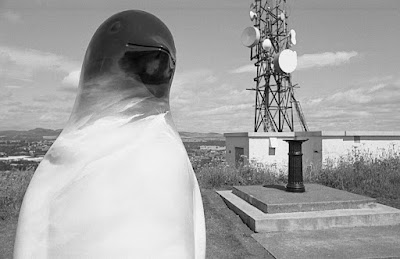
"A Penguin On A Hill With Telecomms Equipment In The Background"
Leica M2, 35mm Summaron, Ilford HP5+ |
Over and oot.
Hxx
.jpeg)
.jpeg)
.jpeg)
.jpeg)
.jpeg)
.jpeg)
.jpeg)
.jpeg)
.jpeg)
.jpeg)

.jpeg)
