Morning folks - at the risk of being boring, I'm sorry but I'm going to go where I've gone before and am going to try to define what photography is to me.
A friend from the DCA forum (Hi Steve!) recently very kindly took me on a small road trip to a fabulous bit of coastline, not too far away.
It was a 'photo-walk', though I was rather encumbered with the 500C/M, 60mm Distagon, 150mm Sonnar and a tripod. Unusually for me I also took a couple of filters - a 0.9 ND and a 25 Red.
Now of course I could have gone light and just taken a digital whatever with zoom and probably got results I would have been happy with (in another life!) and looked at them on a screen and said "Oooh, ain't they lovely!" but I didn't - I wanted something I could print.
The day was extraordinary - it had been a -6 degree sunrise, followed by a biting wind, and then incredibly brilliant sunshine. The latter was so strong that everything was pretty harsh, even at an hour past sun-up; not really what you would call (if there is such a thing) 'ideal photo conditions.'
So I decided, rather than go my usual route of trying to get something 'normal', I'd try something different.
I don't know about you, but the world really does seem like a more exciting place with a red filter on!
I'll put this down to a large costume jewellery fake ruby that I had in my toy box when I was small - I loved it so much that I would quite often view the world that way, and (weirdly) I think it is an element of that, that gives me comfort when I put a red filter on and view the camera-world that way.
Not that I do it very often . . . however (with hindsight and now after printing the negatives) I can honestly say I wish I had done it more often.
And because of that, I have discovered something, which works for me, that has turned what could have been vin ordinaire photographs into something with a bit more character.
I think normal photographic thinking says that really you DO NOT want the levels of contrast a red filter gives in a photograph. OK, it brings out the clouds for a bit of drama and that's OK, even acceptable in a sort of photo club competition way.
But I'm not a member of a photo club and don't like competitions; I like my landscape real and atmospheric, not chocolate box and someone else's ideal of what a landscape should look like.
The sun had blasted any atmosphere clean out of its trousers - it wasn't going to look good.
So I had a thunk whilst walking and talking:
Hmmmmmm - what if I metered the scene for its shadows and placed them on Zone III (my normal practice) then, given the possible crossover into reciprocity failure because of stopping down a lot (only 1/500th on a Hasselblad remember - gotta take it to f32 or f 45) really gave them a massive dose of exposure.
Then processed the film using a semi-compensating dilution of something like HC110 (Dilution H in my case) and really didn't agitate too much . . then, when they were dry, print them on Grade 1?
I could have done with a cuppa at that point and tbh, Grade 1 never occurred to me until I had the negs developed. But that's the beauty of film-based photography - betwixt the snappin' and the flappin' something happens - not always for the best, and other times a surprise.
In the dark, DeVere whooshing away, trying to print the negatives, I encountered a tonality I've not encountered in my prints before.
Normally, when I've printed on soft grades they have been extraordinarily disappointing.
Shite is actually the word of choice.
No two ways about it . . even though you're supposed to with a harder negative.
But this time I seem to have encountered John Blakemore's (you've never heard of him????? c'mon) tonality, in an entirely accidental way.
It is hard to tell from the scans, but if you were to grab a print and a cuppa and sit down with me, you'd see it.
Of course, though, this is roll film - a collection of strangers locked forever in time on the same strip of polyester - they're not all going to be printed on the same grade (as you can see) but those three I have put below (the Grade 1 prints) to my eyes, definitely have the Blakemore thing going on.
So if you try to use this method and are only scanning your negatives . . . good luck.
But if you are printing I hope it works for you as it has for me.
 |
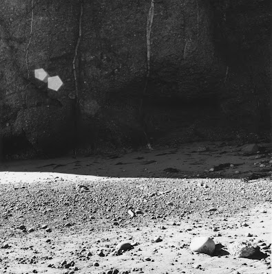
| 500 C/M, 60mm Distagon, No Filter. Sunstars pure happenstance. Grade 4.5 |
 |
| 500 C/M, 150mm Sonnar, Red 25. Grade 1 Hello John |
 |
| 500 C/M, 150mm Sonnar, Red 25. Grade 1 Hello John |
 |
| 500 C/M, 150mm Sonnar, Red 25, ND 0.9. 7 Second exposure, f32 Grade 1 Hello John |
 |
| 500 C/M, 150mm Sonnar, Red 25, ND 0.9. 10 Second exposure, f32 Grade 3 (to bring up the surf) |
I found myself getting tired and frustrated and then elated.
I decided to do something about it.
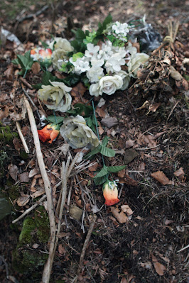
Regular readers will know I have a Sony A6000 and Nikkor adapter, so the following day I took it up to Balgay cemetery to try and prove something to myself.
The lens was the Pre-Ai 24mm Nikkor, and below are the two things I am happy with:
 |
| Sony A6000, 24mm Pre-Ai Nikkor |
 |
| Sony A6000, 24mm Pre-Ai Nikkor |
The colours are lovely - very muted, which is what I expected from early Nikon coating and I think in another life I would be happy.
But they just don't give me any feeling at all.
Nada.
Zilch.
They're cold.
And I went back and reviewed many digital images, and felt exactly the same way.
Then I looked at prints - the good, the bad, and the downright ugly - and I felt some affection for them.
And I believe that is because I had to put the effort in to make them.
Countless hours, learning and seeing and thinking and appreciating.
The feeling of nausea that I'd wasted a £2.50 sheet of paper.
The anticipation of a final image . . . that final rise to the surface and completion of development like some primordial art work being discovered for the first time.
It is a HUGE THING.
It's wonderful.
I'm typing this with a shiver, because it can really get to you.
With digital everything is perfect; there's no waiting; anticipation is defused simply by the act of looking at your camera screen.
I imbue my prints with my feelings.
They are a struggle, and surely half of what life can be about, is struggle.
Yes, easy can be lovely and wonderful, but when you are trying to create (sorry folks) ART, then the struggle is the hone.
And that's it. That's why I do it.
I should be certified.
Putting your ALL into something has both benefits and disadvantages. I like to think the benefits outweigh the latter.
So, despite the ease of digital, I am going to keep on keeping on till they stop making the stuff (film and paper and chemicals).
I love it.
It's been a part of me for a huge chunk of my life and ONLY FILM AND DARKROOM PRINTING will satisfy me.
Full stop.
The end.
Must go now - that pasta has been boiling for about 3 hours . . . .
H xxx

Nothing wrong with a bit of experimentation, Phil. These look good. The process you described seemed quite complicated and involved, though. Have you considered split grade printing? Haha.
ReplyDeleteYes - have considered it, but don't necessarily think it would bring anything to the show as it were. Not much in the way of complication - just slightly different to the usual process and no Pot Ferri in sight.
ReplyDeleteHi Phil. Again, a thought-provoking post. Re your last paragraphs...I guess every dedicated darkroom printer has wrestled with this question. I know I have a lot. Why do we keep doing it when the world seems to have moved on? I find the question a very tough one though, because the danger of coming up with self-serving arguments is very high IMO. These arguments might really only try to justify what actually is the result of a specific personal temperament and set of values (which are even ultimately linked to our genes).
ReplyDeleteMore recently I've been re-evaluating this question against the backdrop of AI imagery and fakery: today, what I value most about film and the darkroom above else is the authenticity. Whatever is on film really "was" (but then one could say the same about a raw file? Maybe I still haven't thought this through). In any case, when AI goes completely berserk I think there is a good chance many photographers will say enough with this shit, and dust off their fully manual cameras.
What film was it with these pictures by the way? Those sunstars might be happenstance but they align perfectly with the rocks on the lower right.
Hope the pasta was OK :)
Hi Omar - many thanks as always - hope you are well.
ReplyDeleteI'll reply in reverse order . . .
Pasta was mush.
FP4 developed in HC110 Dilution H - it coped pretty well with the extremes. The sunstars is a "VERY" slight crop to align things - it is only slight, but you spotted what I spotted when the negs were drying.
Digi photogs are already beginning to doubt things - and the thing is a RAW file might well be it, only with the meta-data in place - other than that, it is a random collection of 1's and 0's and any Ai can generate that. At least for ourselves we can say "WE HAVE THE NEGATIVES! - GET IT UP YE!!"
The difficulty of printing as opposed to the relative ease of digi-printing comes down to one thing - we're masochists. And yet, the pleasure of a good print is exquisite isn't it. At the end of the day, I think it is the craftsperson in our genes coming out - it's as much a skill as cobbling or carving and having tried a few craft things I can honestly say it is the one that I garner the most enjoyment from. It is worth the effort, even if it is only for oneself.
Keep on going - the coming world needs us.
I like the second photo a lot. My eye is drawn to the bright building in the background, but then there are a lot of interesting things to look for in the shadowy foreground.
ReplyDeleteThe colour photos are lovely. I always associate Sony digital pictures with over-the-top saturation, but I guess that's just how people adjust them on the computer. To be honest, most people go over-the-top in the digital darkroom.
Thanks Marcus - appreciated. The Sony is as is, no footering at all so I guess it is all down to the olden Nikkors!
Delete